

How to integrate a JavaScript component as reusable widget
For one of my projects, I needed a widget that allows panning and zooming around in a large image. In this short tutorial, I want to share with you how I implemented it based on the wonderful panzoom component by Timmy Willison.
Summary
What you will learn in this tutorial:
- How to integrate an external JavaScript component
- How to implement a reusable widget
- How to use it in a simple demo app
If you just need the component, you can take the shortcut and scroll to the end of this article.
What you need
If you want to follow up the implementation on your own, you need:
- An OutSystems account (a free personal environment is sufficient)
- OutSystems Service Studio
- JavaScript panzoom library by Timmy Willison (licensed under MIT)
For this tutorial you should already have some experience in building reactive web applications with OutSystems.
Because we aim for a reusable component, I decided to split the project into two separate OutSystems modules: the widget itself and a demo app to test it.
Build a reusable widget
Get the panzoom JavaScript library
Timmy Willison has built a nice JavaScript component, which utilizes CSS transforms to allow a performant way of panning and zooming things around a webpage. You can play around with his demos and learn more about it on his homepage. All sources are available unter MIT license on GitHub:
GitHub – timmywil/panzoom: A library for panning and zooming elements using CSS transforms
You can find several options to build the sources there. For our OutSystems component we only need the compiled JavaScript which can be loaded from a cdn:
https://unpkg.com/@panzoom/panzoom@4.5.1/dist/panzoom.min.js
As I want to have the component independent from cdns for varied reasons, I grab the minified version from the cdn link and import it into the OutSystems module.
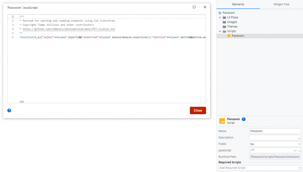
Create the reusable web block
Next, we must integrate the JavaScript as a reusable ui component. In OutSystems this is done with (web) blocks that, like screens, live in a ui flow. By default, your module contains a flow named MainFlow. I recommend renaming it to the same name as your widget module, so later you can easily find all blocks of your module in projects that use it.
Let’s rename the ui flow and add a new block Panzoom to it. As we want to use this web block from other modules, we need to set its attribute Public to Yes. Because it depends on the panzoom JavaScript we also need to append Scripts.Panzoom to the required scripts.
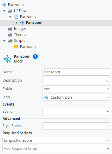
You can also add a custom icon if you want to.
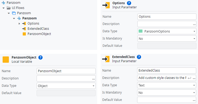
Screens using our panzoom widget will communicate with the widget via input parameters. The component itself provides a variety of options and I chose to use a structure PanzoomOptions in OutSystems to hold them.
/**
 * PanzoomOptions
 *
 * @property {bool} [Animate] = False
 * Whether to animate transitions
 *
 * @property {bool} [Canvas] = False
 * This option treats the Panzoom element's parent as a canvas. Effectively,
 * Panzoom binds the down handler to the parent instead of the Panzoom
 * element, so that pointer events anywhere on the "canvas" moves its
 * children. See issue #472.
 * Note: setting this option to true also changes where the cursor style is
 * applied (i.e. the parent).
 *
 * @property {int} [Duration] = 200
 * Duration of the transition (ms)
 *
 * @property {string} [Easing] = "ease-in-out"
 * CSS Easing used for transitions
 *
 * @property {string} [ExcludeClass] = "panzoom-exclude"
 * Add this class to any element within the Panzoom element that you want to
 * exclude from Panzoom handling. That element's children will also be
 * excluded. e.g. links and buttons that should not propagate the click event.
 *
 * @property {string} [Overflow] = "hidden"
 * The overflow CSS value for the parent. Defaults to 'hidden'
 *
 * @property {decimal} [StartScale] = 1
 * Scale used to set the beginning transform
 *
 * @property {decimal} [StartX] = 0
 * X value used to set the beginning transform
 *
 * @property {decimal} [StartY] = 0
 * Y value used to set the beginning transform
 *
 * @property {string} [TouchAction] = "none"
 * This value is used to set touch-action on both the Panzoom element and its
 * parent. It is needed because that the native scroll on mobile interferes
 * with panning and pinch zooming. Set this to empty string to re-enable
 * scrolling on mobile, but note that both scrolling and panning cannot work
 * at the same time.
 *
 * @property {string} [Contain] = ""
 * "inside" | "outside"
 *
 * @property {string} [Cursor] = "move"
 * The cursor style to set on the panzoom element
 *
 * @property {bool} [DisablePan] = False
 * Disable panning functionality. Note: disablePan does not affect focal point
 * zooming or the contain option. The element will still pan accordingly.
 *
 * @property {bool} [DisableXAxis] = False
 * Pan only on the Y axis
 *
 * @property {bool} [DisableYAxis] = False
 * Pan only on the X axis
 *
 * @property {bool} [PanOnlyWhenZoomed] = False
 * Disable panning while the scale is equal to the starting value
 *
 * @property {bool} [RoundPixels] = False
 * Round x and y values to whole numbers. This can help prevent images and
 * text from looking blurry, but the higher the scale, the more it becomes
 * necessary to use fractional pixels. Use your own judgment on how much to
 * limit zooming in when using this option.
 *
 * @property {bool} [DisableZoom] = False
 * Disable zooming functionality
 *
 * @property {decimal} [MaxScale] = 4
 * The maximum scale when zooming
 *
 * @property {decimal} [MinScale] = 0.125
 * The minimum scale when zooming
 *
 * @property {decimal} [Step] = 0.3
 * The step affects zoom calculation when zooming with a mouse wheel, when
 * pinch zooming, or when using zoomIn/zoomOut
 */
Now that we have created the structure, we can add the input parameter Options of type PanzoomOptions and the input parameter ExtendedClass to our web block. This will later allow the configuration of the panzoom component and setting additional CSS classes. We also need a local variable PanzoomObject to hold reference of our panzoom object, so we can access it via JavaScript.
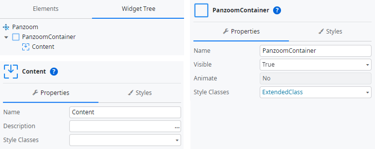
For later apps to place pan and zoomable content into the widget, we also need to add a container and a placeholder to the widget tree. The container is a wrapper that gets the ExtendedClass als Style Classes. The placeholder’s name is visible for developers using our component, so “Content” would be a descriptive option. It is also later referred in our JavaScript to identify the HTML element to render the panzoom component.
To bring panzoom to life, it’s time for a little bit of scripting. When the DOM of our web block is rendered, we need to initialize the panzoom component to have it render its HTML elements into the DOM as well. For this we have the OnRender event in OutSystems, which is fired when the block is ready after its first render.
You can add custom JavaScripts to your OutSystems client flows and to transfer data between it and the OutSystems flow you can define input and output parameters. Unfortunately, structures cannot be select as data type here, so we must serialize our options to JSON first. As mentioned above, we need a reference to the HTML element the panzoom should render into. This is done via the parameter ElementId, also of type Text. The JavaScript will output an object representing the panzoom component which we want to store in our local variable PanzoomObject. Last, we fire the own event OnReady to allow consumers of our widget to perform custom actions after we initialized the panzoom. We also pass the reference to the panzoom object to the consumer for reasons described later.
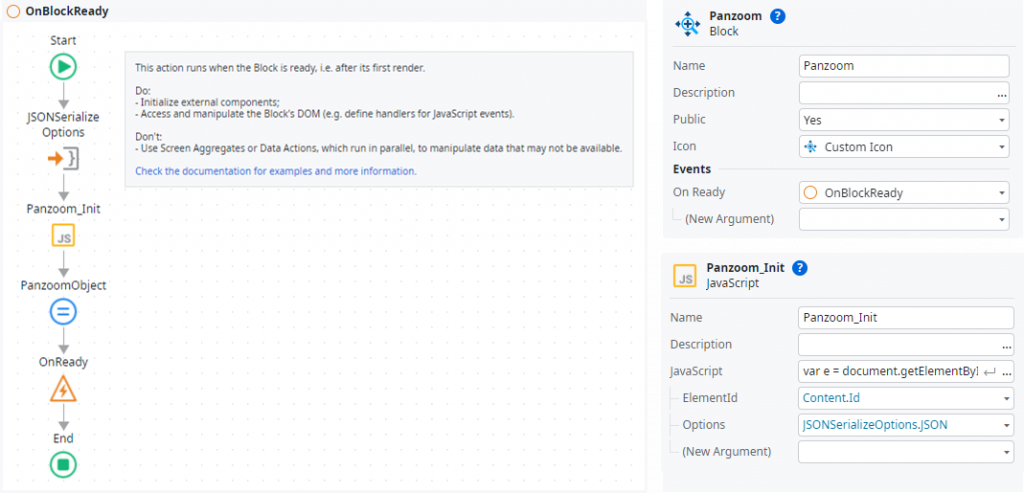
You can copy and paste the following listing into the JavaScript added above:
/**
 * Panzoom_Init
 *
 * @param {string} ElementId
 * @param {string} Options
 * @return {object} PanzoomObject
 */
var e = document.getElementById($parameters.ElementId);
if(!e) throw 'Could not find element "' + $parameters.ElementId + '" for panzoom component.';
var o = JSON.parse($parameters.Options);
var p = Panzoom(e, o);
e.parentElement.addEventListener('wheel', p.zoomWithWheel);
e.addEventListener('panzoomchange', (event) => {
  $actions.PanzoomChange(event.Detail);
})
$parameters.PanzoomObject = p;
As you can see, we add an event listener to the panzoom’s JavaScript event panzoomchanged which calls a client action called PanzoomChange. The panzoom component passes an object with information about the change to the event handler. To make its values available in OutSystems, we need to parse the event object with an additional JavaScript. Afterwards we pass the details X, Y and Scale (all of type Decimal) to our own OnPanzoomChange event to inform the consumer of our widget.
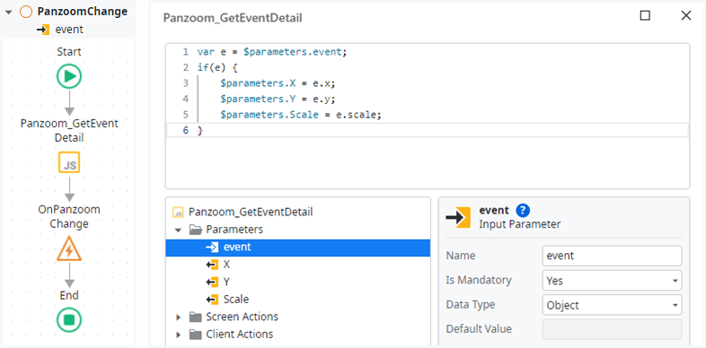
/**
 * Panzoom_GetEventDetail
 *
 * @param {object} event
 * @param {decimal} x
 * @param {decimal} y
 * @return {decimal} scale
 */
var e = $parameters.event;
if(e) {
  $parameters.X = e.x;
  $parameters.Y = e.y;
  $parameters. Scale = e.scale;
}
To properly tidy up everything when then web block is unloaded from a screen in OutSystems, there is another event OnDestroy. This is the correct place to also destroy the panzoom component.
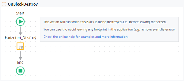
The JavaScript removes the event listener we added for the mouse wheel while initialization and calls the corresponding method of the panzoom object passed as input parameter PanzoomObject which we stored to the local variable PanzoomObject after initialization.
/**
 * Panzoom_Destroy
 *
 * @param {string} ElementId
 * @param {object} PanzoomObject
 */
var p = $parameters.PanzoomObject
if(p) {
    var e = document.getElementById($parameters.ElementId);
    if(e) e.parentElement.removeEventListener('wheel', p.zoomWithWheel);
    p.destroy();
}
Now there is one important block event left: OnParametersChanged, which is fired every time one input parameter of the web block is changed. In our case for example this will happen when the Options get changed by the screen the panzoom widget is placed on. To handle this event correctly we need to update the panzoom component’s options.
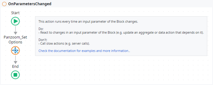
Where did this strange looking client action Panzoom_SetOptions come from? We now will implement it together with some other client actions we will publish to the consumer of our widget.
Implement some public client actions to interact with the panzoom
You already learned the official way to communicate with blocks via input parameters and events. The panzoom component we are integrating here additionally provides some JavaScript methods to be called directly. Those are exposed by the panzoom object we hold in the local variable PanzoomObject during the initialization.
In OutSystems blocks can only expose input parameters and events but no client actions. So, the only way to make the component’s methods available for consumer apps, is to implement public client actions and pass an input parameter with the panzoom object we want the methods to be performed on. This is the reason we passed it to the consumer in our OnReady event.
Below you will find the client action flows and the respective JavaScripts. The input parameter PanzoomObject is passed to all JavaScripts as input parameter as well.
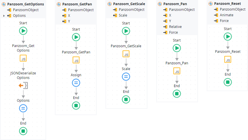
Panzoom_GetOptions returns a copy of the current options object in our OutSystems structure PanzoomOptions. As we cannot pass structures to or from JavaScripts in OutSystems, we must serialize and deserialize it as JSON.
/**
 * Panzoom_GetOptions
 *
 * @param {object} PanzoomObject
 * @return {string} Options
 */
if ($parameters.PanzoomObject) {
  var o = $parameters.PanzoomObject.getOptions();
  $parameters.Options = JSON.stringify(o);
}
Panzoom_GetPan returns the current pan position (x/y translation).
/**
 * Panzoom_GetPan
 *
 * @param {object} PanzoomObject
 * @return {decimal} x
 * @return {decimal} y
 */
if($parameters.PanzoomObject) {
    var p = $parameters.PanzoomObject.getPan();
    $parameters.X = p.x;
    $parameters.Y = p.y;
}
Panzoom_GetScale returns the current zoom scale.
/**
 * Panzoom_GetScale
 *
 * @param {object} PanzoomObject
 * @return {decimal} Scale
 */
if($parameters.PanzoomObject) $parameters.Scale = $parameters.PanzoomObject.getScale();
Panzoom_Pan pans to the given x and y coordinates.
/**
 * Panzoom_Pan
 *
 * @param {object} PanzoomObject
 * @param {decimal} x
 * @param {decimal} y
 * @param {bool} Relative
 * @param {bool} Force
 */
if($parameters.PanzoomObject) {
    $parameters.PanzoomObject.pan(
        $parameters.X,
        $parameters.Y,
        {
            relative: $parameters.Relative,
            force: $parameters.Force
        }
    );
}
Panzoom_Reset resets the pan and zoom to startX, startY, and startScale. By default, it animates ignoring the global option (set Animate to False to override). The method also ignores the disablePan, disableZoom, and panOnlyWhenZoomed options (to override set Force to False).
/**
 * Panzoom_Reset
 *
 * @param {object} PanzoomObject
 * @param {bool} Animate
 * @param {bool} Force
 */
if($parameters.PanzoomObject) $parameters.PanzoomObject.reset(
    {
        animate: $parameters.Animate,
        force: $parameters.Force
    }
);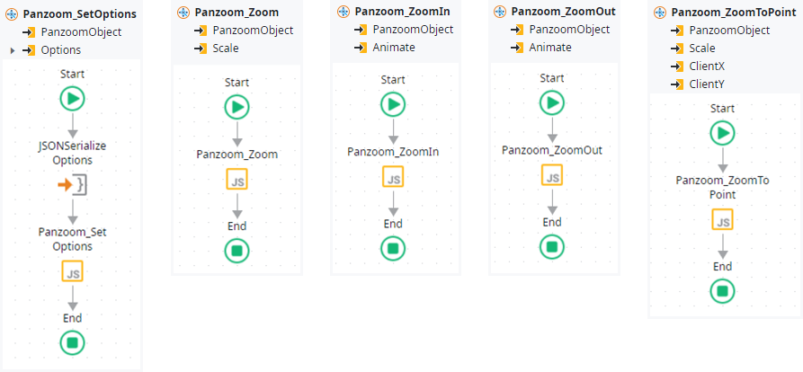
Panzoom_SetOptions updates the options of the panzoom instance with the given PanzoomOptions structure, which of course must be serialized as JSON to be passed to the JavaScript.
/**
 * Panzoom_SetOptions
 *
 * @param {object} PanzoomObject
 * @param {string} Options
 */
if ($parameters.PanzoomObject) {
    var o = JSON.parse($parameters.Options);
    $parameters.PanzoomObject.setOptions(o);
}
Panzoom_Zoom zooms the panzoom element to the given scale.
/**
 * Panzoom_Zoom
 *
 * @param {object} PanzoomObject
 * @param {decimal} Scale
 */
if($parameters.PanzoomObject) $parameters.PanzoomObject.zoom($parameters.Scale);
Panzoom_ZoomIn zooms in using the predetermined increment set in options. Animates by default, ignoring the global option (set Animate to False to override).
/**
 * Panzoom_ZoomIn
 *
 * @param {object} PanzoomObject
 * @param {bool} Animate
 */
if($parameters.PanzoomObject) $parameters.PanzoomObject.zoomIn({ animate: $parameters.Animate, });
Panzoom_ZoomOut zooms out using the predetermined increment set in options. Animates by default, ignoring the global option (set Animate to False to override).
/**
 * Panzoom_ZoomOut
 *
 * @param {object} PanzoomObject
 * @param {bool} Animate
 */
if($parameters.PanzoomObject) $parameters.PanzoomObject.zoomOut({ animate: $parameters.Animate, });
Panzoom_ZoomToPoint zooms the panzoom element to a focal point using the given Scale and point (ClientX/ClientY).
/**
 * Panzoom_ZoomToPoint
 *
 * @param {object} PanzoomObject
 * @param {decimal} Scale
 * @param {decimal} ClientX
 * @param {decimal} ClientY
 */
if($parameters.PanzoomObject) $parameters.PanzoomObject.zoomToPoint(
    $parameters.Scale,
    {
        clientX: $parameters.ClientX,
        clientY: $parameters.ClientY
    }
);
Congratulations, you have now integrated the panzoom JavaScript component as a reusable widget for OutSystems. Now it’s time to try it out in a demo app.
Build a demo app
The purpose of the little demo app we will implement now, is to display a SVG graphic and allowing to “panzoom” around and test the functionality implemented above.
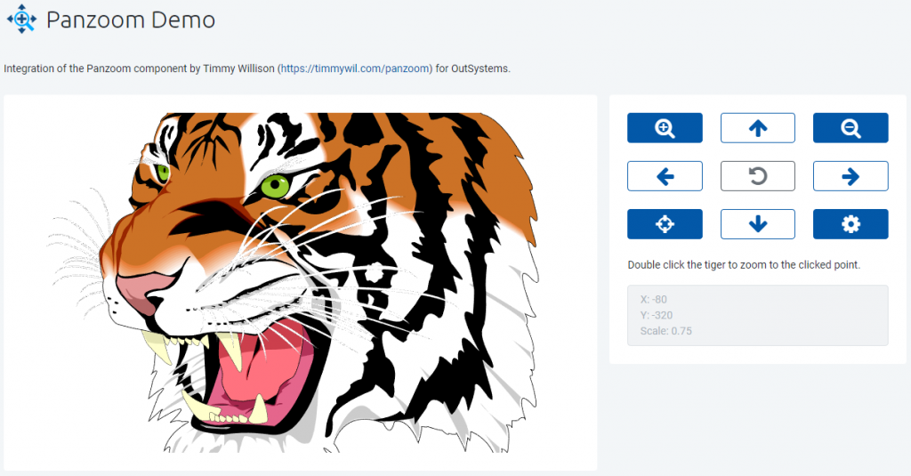
We start by adding a dependency to the module holding our panzoom widget and activate all checkboxes for the block, client actions and structure. Afterwards we must add the home screen, I simply named “Demo”, to the MainFlow. The layout is based on an Adaptive\ColumnsMediumRight block. The left column holds the panzoom component, the right one contains a control panel to play around with the demo.
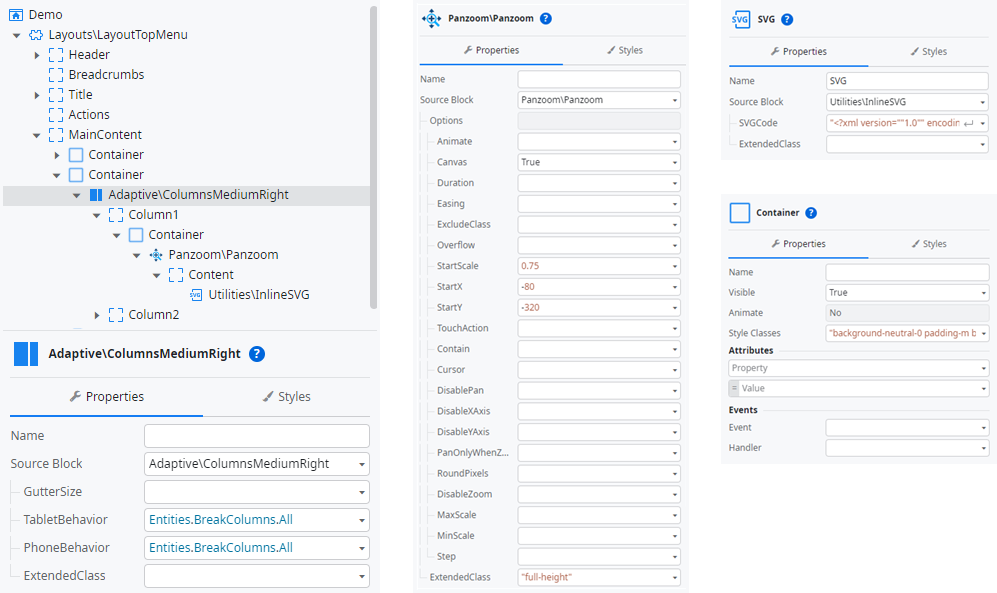
To configure the panzoom component, we expand the Options parameter of the added Panzoom block. By doing so, we can see all attributes of the underlaying structure PanzoomOptions and provide initial values for all the options. The values used in this example are suitable for the used tiger graphic but please feel free to play around with them or change them according to the content you want to use. The block also has the ExtendedClass parameter which is set to “full-height” here to make sure, the panzoom area takes the available space in its parent container.
The content we want to be pan- and zoomable is placed into the Content placeholder of the Panzoom block. In this example we simply use a SVG graphic. In this example we use an SVG graphic, which has the advantage that it can be losslessly scaled. To directly display SVG graphics in OutSystems there is the Utilities\InlineSVG block in OutSystemsUI, which embeds the given SVGCode. Because this input parameter is of type Text, we must enclose in the SVG in double quotes and encode all containing double quotes. For your comfort and better readability of this article, you can find the ready to copy sample graphic on my gist. Please don’t forget to give the InlineSVG widget a name (here simply “SVG”) as we need it later to reference the HTML element in JavaScript.
The parent container ist styled by using the following CSS classes:
background-neutral-0 padding-m border-radius-softNext, we want to implement some code to test the different functionalities the Panzoom widget offers. First, we need a local variable Panzoom of type Object to hold the panzoom object and implement handlers for the events of the Panzoom widget:
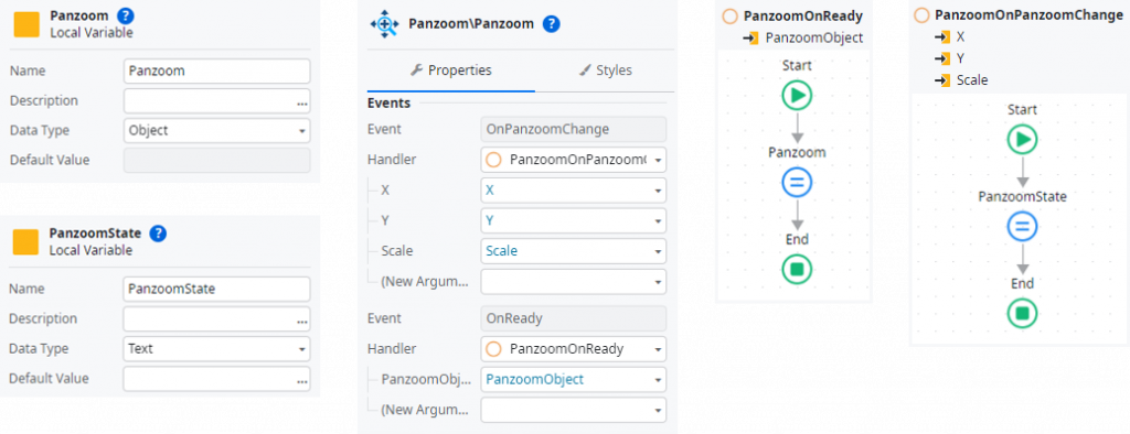
PanzoomOnReady simply assigns the received PanzoomObject to the local variable Panzoom.
PanzoomOnPanzoomChange is triggered every time the state of the panzoom component changes. To later monitor the state on the screen the event handler composes a Text and assigns it to the local variable PanzoomState by using the following expression:
"X: " + X + NewLine() + "Y: " + Y + NewLine() + "Scale: " + ScaleThe control panel in the second screen column (right side) offers a button field for the different client actions and a control to display the current panzoom state.
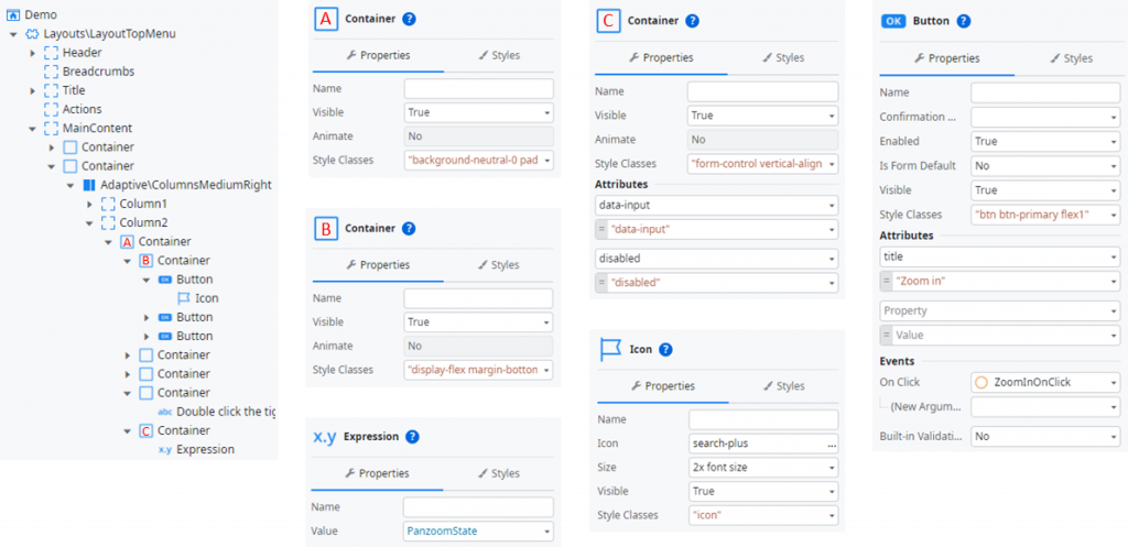
The control panel consists of a parent container (A), in which three button containers (B) with three buttons each are arranged. The additional attribute title is used to get a simple tooltip for the buttons. For the sake of simplicity, you will find the style classes to copy out here:
Container A: background-neutral-0 padding-m border-radius-soft
Container B: display-flex margin-bottom-m
Buttons:     btn btn-primary flex1
The control zu display the current panzoom state is constructed with a container (C) faking to be a disabled input control by utilizing the two additional attributes data-input and disabled. The expression inside is bound to the local variable PanzoomState.
Each button has a corresponding OnClick event handler that calls the related client action of our Panzoom component:
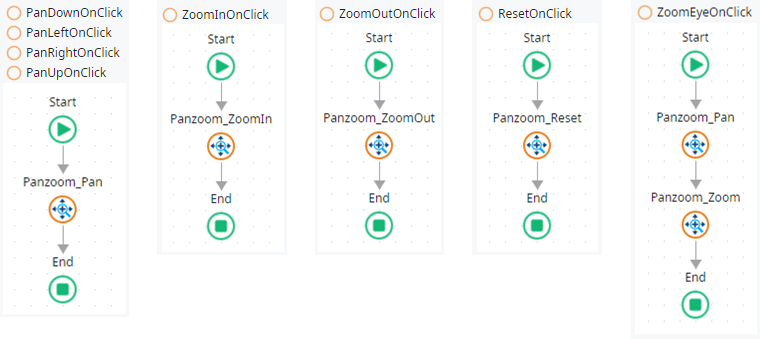
Pan[Direction]OnClick calls the Panzoom_Pan client action with the following parameters:
Down:  X =   0, Y =  10, Relative = True
Left:  X = -10, Y =   0, Relative = True
Right: X =  10, Y =   0, Relative = True
Up:    X =   0, Y = -10, Relative = True
ZoomEyeOnClick zooms to the “eye of the tiger” using the following parameters:
Panzoom_Pan: X = -40, Y = 91, Relative = False
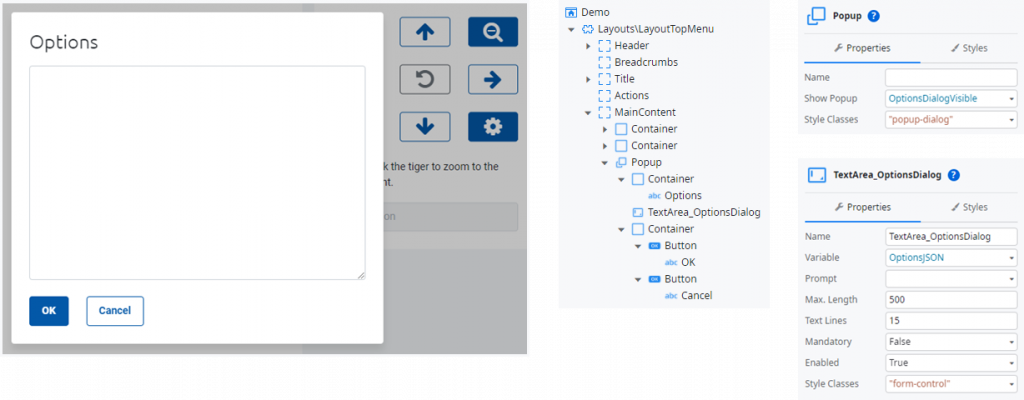
Panzoom_Zoom: Scale = 3.6The last button with the cog icon opens a popup dialog which allows the user to manipulate all options of the PanzoomOptions structure. For simplicity this is implemented as a rudimentary JSON editor. Therefore, we need the following local variables and client actions in the screen:
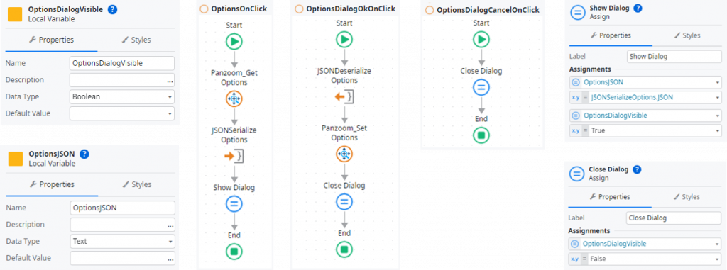
OptionsOnClick handles when the cog button is clicked and requests the current options from the panzoom component via Panzoom_GetOptions, serializes the retuned PanzoomOptions structure, assigns the resulting JSON to the local variable OptionsJSON and shows the popup by setting OptionsDialogVisible to True.
OptionsDialogOkOnClick handles when the OK button of the popup dialog is clicked, deserializes the JSON user input in OptionsJSON and updating the panzoom component via Panzoom_SetOptions. Afterwards the popup dialog is closed by setting OptionsDialogVisible to False.
OptionsDialogCancelOnClick handles clicks on the Cancel button of the popup dialog.
The UI of the options popup dialog is built as shown in the next figure:
The last feature we want to implement is ability to zoom in to a point of the graphic the user double clicks. Therefore, we must implement the client action ImageOnDblClick to handle when the user double clicks and register it as an event listener in the browser. This can be achieved with JavaScript we place into the OnReady event of our screen. This receives the ElementId of the InlineSVG widget via an input parameter.
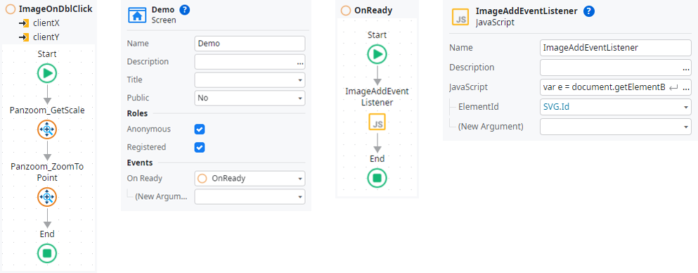
/**
 * ImageAddEventListener
 *
 * @param {string} ElementId
 */
var e = document.getElementById($parameters.ElementId)
e.addEventListener('dblclick',(event) => {
    $actions.ImageOnDblClick(event.clientX, event.clientY);
});
Well done! You have made it through and also created the demo app. You can now publish and test the application and the panzoom component integration.
Get the ready-to-use component from the Forge
I already published the component in the OutSystems Forge (Panzoom Reactive) so you can use it in your apps as well. I would be happy if you leave some claps and/or a coffee 😉
I hope you enjoyed reading this tutorial and recreating it in your environment. If the article was interesting for you, I would be pleased if you follow me on my social media accounts. In case you have any questions left open or have tips for me to improve, please contact me via Medium or my OutSystems profile.